Because everything you build is communicating something — whether you chose it or not
By Steve Chong, CMO & Founder, Oh My Galore
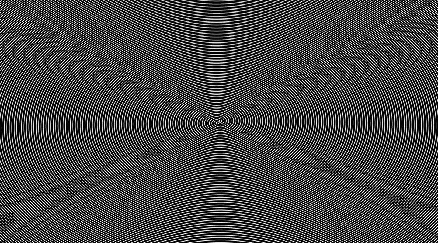
The image at the top of this page is not moving. You are.
Scroll past it. Tilt your head. Let your eyes go soft just left of center.
It breathes. It rotates. It pulls.
And yet nothing on this page has changed a single pixel since it loaded. There’s no animation file. No GIF. No JavaScript quietly draining your battery. It’s a still image — concentric lines, precise spacing, ruthless contrast — and your brain is doing every bit of the work.
That’s the thesis of this entire site: design is not what you put on the page. Design is what happens inside the person looking at it.
Most people building companies get this exactly backwards.
Design is happening whether you control it or not
Every business is already designed.
Your website is designed. Your proposal is designed. Your pitch deck, packaging, office, onboarding flow, invoices, out-of-office reply and Sunday-night Instagram post are all designed.
Even neglect is a design decision.
A site that’s hard to navigate — that’s design. An offer that takes five paragraphs to explain — design. A menu that paralyzes a hungry customer — design. Signage that leaves people spinning in a lobby — also design. Just not good design.
So the question was never does my business use design. The question is whether you’re directing it or letting it happen to you.
And customers don’t experience your brand as a stack of separate deliverables. They experience one continuous system of signals. The colour on the site sets an expectation. The tone of the email builds or burns trust. The weight of the packaging assigns a price in their head before they check the tag. The speed of your support reply either confirms the promise your marketing made — or exposes it.
Brand design isn’t a logo applied everywhere. It’s one idea, expressed consistently, through everything.
The state of design right now: technically excellent, spiritually empty
Take an honest walk through the internet today.
Every SaaS homepage has the same gradient mesh, the same Inter at the same three weights, the same three-column feature grid, the same “Trusted by” logo bar bled to 40% opacity. Every DTC brand has the same sans-serif wordmark stretched to 200% letter-spacing over the same beige studio photography. Every restaurant menu is the same thin uppercase type on the same recycled card stock.
Everything looks clean. Everything works. Everything feels the same.
It is all competent. It is almost never memorable.
Templates aren’t the enemy. Trends aren’t the enemy. AI isn’t the enemy — good designers have always used the best available tools. The problem begins when convenience replaces intention.
A template gives you structure; it can’t decide what your business should mean. A trend gives you relevance; it can’t give you a point of view. AI accelerates execution; it can’t manufacture taste, judgment or conviction on command.
A beautiful website that could belong to any company isn’t a strong brand experience. It’s attractive anonymity.
We’ve arrived at an era of infinite tooling and finite courage. The floor rose, and everybody stopped at the floor. Which means the gap between “good enough” and “unforgettable” has never been wider — and never been cheaper to cross, if you’re willing to actually think.
Meanwhile the physical world flipped. Walk into a hotel lobby built this decade and you’ll find warmth, weight, imperfect plaster, hand-thrown ceramics, real wood with real knots. Physical design is sprinting toward evidence-of-hand at the exact moment digital design sprints away from it.
That’s not coincidence. That’s a market signal. People are starved for things that feel made by somebody.
What the illusion actually teaches
The spiral is a useful teacher.
Its effect doesn’t depend on animation, video or technology. It uses contrast, repetition, density and curvature to produce the sensation of movement. The image creates more than it contains.
That’s the magic — and it’s the standard.
Great design works the same way. It creates momentum without shouting. It invites interaction without issuing an instruction. It holds attention because the experience changes depending on how the audience approaches it.
It also proves that design isn’t confined to the object. The experience happens between the object and the observer. A website is static, but the visitor is moving through it. A package is motionless, but it’s being held, opened, interpreted. An identity is a fixed set of elements living inside a moving cultural and competitive environment.
Good design anticipates that movement. So it stops asking “how does this look?” and starts asking:
- What does someone notice first?
- What emotion does this create?
- What assumptions does it trigger?
- How does the experience change as they move through it?
- What action does it naturally encourage?
- What stays in their mind afterward?
Those aren’t cosmetic questions. They’re strategic ones.
What “obsession” actually means — and what it doesn’t
Let’s kill a myth. Obsessing over design is not nudging a button two pixels for six days while sales, ops and customers wait outside. That isn’t obsession. That’s decorative procrastination in expensive glasses. Perfectionism is fear wearing a turtleneck.
Real obsession is refusing to accept the first solution because you suspect a better one exists — and then having the discipline to ship anyway.
Here’s how I run it.
1. Design the feeling before the file. Before Figma opens, finish this sentence: When someone lands here, they should feel ______. Confident. Curious. Caught off-guard. Safe. If you can’t finish it, you’re not designing, you’re decorating. The illusion above exists because the intended feeling was “wait, what?” Everything else was reverse-engineered from that.
2. Obsess over clarity. Can someone understand what you offer, who it’s for and why it matters within seconds? Confusion is rarely persuasive — and polish applied to a confusing message just amplifies the confusion at higher resolution.
3. Obsess over hierarchy. Not everything can be the most important thing on the page. Strong design creates an order of attention: where the eye starts, where it travels, where it acts. Decide what matters most, then give it the weight it deserves.
4. Find the one unreasonable detail. Every memorable brand has one element that took an irrational amount of effort. A custom ligature. A hand-drawn illustration set. A checkout animation that shouldn’t matter but does. Pick exactly one. People extrapolate care from a single unreasonable detail. Ten unreasonable details signal chaos and torch your timeline.
5. Subtract until it hurts, then subtract one more. The illusion works because it has one variable: lines. No colour, no gradient, no texture. Add a drop shadow and it dies. Your homepage has a drop shadow somewhere it shouldn’t. Go find it.
6. Obsess over friction. Audit every unnecessary click, confusing sentence, broken transition and unanswered question. Friction isn’t always bad — sometimes it builds focus, anticipation, perceived value. But accidental friction quietly bleeds attention, confidence and revenue.
7. Obsess over distinction, not just professionalism. Don’t ask only whether the work looks professional. Ask whether it’s recognizable. Professionalism gets you into the room. Distinction is why anyone remembers you after you leave it.
8. Test on tired people. Not designers. Not your co-founder. Someone at 9pm, on a phone at 11% battery, standing on a moving train. That’s your actual user. If the hierarchy survives that, it survives anything.
9. Design the boring surfaces. Your invoice. Your 404. Your password reset. Your out-of-stock message. Nobody screenshots a hero section anymore — people absolutely screenshot a delightful error state. Brand lives in the unglamorous places because that’s exactly where competitors never look.
10. Design the promise and the delivery. A striking homepage can’t rescue an incoherent proposal. Beautiful packaging can’t survive poor service. A brilliant identity can’t outrun repeated operational disappointment. Consistency between what you look like and how you behave is the brand.
Why entrepreneurs should care in dollars, not vibes
If the artistic argument doesn’t land, take the pragmatic one.
Design is the cheapest form of leverage available to a founder. It’s the only lever that simultaneously raises conversion, lowers acquisition cost, increases pricing power, shortens sales cycles and improves recruiting — all from the same investment.
- Trust compression. A stranger decides whether you’re legitimate in well under a second, visually, long before they read a word of your copy.
- Pricing permission. Two identical products; one designed with care. The designed one charges more. Every time. Design is the socially acceptable way to say we’re worth it.
- Free distribution. Beautiful things get shared. Sharing is unpaid media — the only channel that gets cheaper as you scale.
- Internal clarity. A strong design system is a decision-making machine. Teams that know what they look like ship faster, because half of all product debate is unresolved identity debate in disguise.
And the part most founders miss: design compounds and ads don’t. Every dollar of paid acquisition evaporates the second you stop spending. Every hour invested in design keeps working while you sleep, on every surface you own, for years.
Taste is a business advantage
Taste sounds subjective, intangible, maybe a little indulgent. In practice it’s a disciplined ability to recognize what belongs, what distracts and what should be removed. It’s knowing when something needs more energy and when it needs restraint — the judgment to tell minimal from empty, expressive from chaotic, familiar from forgettable.
And it’s trainable. Taste is built through observation.
Study architecture. Read menus like documents. Examine packaging in a supermarket aisle you have no business standing in. Visit galleries. Notice typography in old books, the rhythm of city streets, the choreography of a well-run restaurant. Look far outside your own industry — industries inbreed visually when they only study competitors.
Then ask why it works.
The goal isn’t a prettier moodboard. The goal is better decisions, made faster, under pressure.
Design is not decoration. It is direction.
Entrepreneurs spend their entire lives trying to create movement. Unaware to interested. Interested to convinced. Convinced to committed. An idea from imagination into the world.
Design creates that movement. Sometimes through a bold identity. Sometimes through a clearer sentence, a quieter page, a more intuitive process, or the removal of something that never needed to exist.
And sometimes through a static black-and-white image that starts moving the moment you do.
Come back to the top for a second. Those lines are provably, measurably still. But they produced motion, tension and a physical reaction in your body using nothing but spacing and contrast. No budget. No animation team. No render farm. Just an obsessive understanding of human perception and the restraint to use one idea instead of ten.
That’s the whole job.
You don’t need a bigger budget. You need a better idea, executed with more care than the situation strictly requires — enough care that something happens inside another person using materials as humble as a black rectangle and some white lines.
Most companies are building animations. The best ones build illusions: experiences so well-considered that the audience supplies the magic themselves.
Obsess over design. Not for perfection. For clarity, distinction and movement — because when design, strategy and execution finally point the same direction, a business becomes very hard to ignore.